Hey folks. If you haven’t heard, responsive design is the new web standard. With mobile devices quickly dominating the web viewing experience it is imperative that sites take their mobile market into consideration when it comes to design. That is why StudioPress adopted responsive design. This allows the same great desktop designs to be used on mobile devices without unneeded clutter. The themes have come a long way but one major limitation is the logo.
Your logo should look great on any device. Trying to scale a desktop logo down for a mobile platform won’t work and for most users the mobile logo just isn’t going to cut it for the desktop.
That is where the Genesis Responsive Header plugin comes in.
Your logo should look great on any device
With the Genesis Responsive Header plugin you can set a different header image for the major device sizes: 768px, 480px, 320px, and 240px. This means your logo will look great on each device and if you set the right size image for each of these sizes you also reduce the load time, which is a huge factor for mobile visitors. Someone with an old Android based phone doesn’t want to wait white your big, beautiful 1140×200 logo gets loaded and then tries to scale down to 240×40. Instead, make a great looking 240×40 logo from the start.
What You Need
You absolutely must have a Genesis child theme for this to work right. The CSS won’t work for other themes and the plugin won’t even activate on other themes. You also must have a responsive child theme. The code will actually output even if the theme isn’t responsive, but it is bound to look really weird and stretched on mobile devices. Please don’t think this plugin will make a theme responsive. It works with existing responsive themes.
You should probably get at least one logo that is intended for use on mobile devices. This plugin supports up to 4 logos, but you don’t have to work with all 4.
Settings
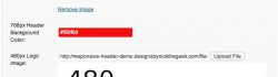
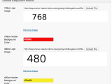
After installing the plugin you will be able to find the “Responsive Header” menu under the Genesis menus item in your dashboard. This will bring up a simple settings screen.

As you can see, the settings screen is very simple. There are two options for each device width. You may upload an image, use a URL, or select an image from your gallery. The image is used without cropping. One thing to watch for is the option for the image size should be set to full size unless you wish to use the scaled WordPress image sizes. This is just like the uploader used for WordPress post images.
Each device size can also have a specified Header background color using the built in color selector.
The only other option is at the very bottom of the settings. You may disable the javascript if it is conflicting. The javascript isn’t absolutely required, but it will make things fit a bit better if you ever view in between the generic device widths. Leave it enabled unless you need to disable it.
How it Works
This is the really cool part. The extra CSS only outputs if you fill these values in. If you setup the 480px device width it will not change your logo until you reach that width. The 768 device width will still show the default header image. However, if you add the 768px logo image it will scale that and use it for smaller devices as well.
make sure your image is at least as wide as the device size you are setting it up for, otherwise things are going to get stretched and that won’t look good
You don’t need to set the height of the image anywhere. This plugin uses some PHP to get the height and set that value automagically. This is one of the key features that make things work right. just make sure your image is at least as wide as the device size you are setting it up for, otherwise things are going to get stretched and that won’t look good.
Once you add an image, the plugin does the rest. It will remove the existing header background on the mobile sizes and add some fallback CSS to ensure the header sizes right. Instead of setting this image as the background for #header it sets it as the background for #title-area. This is important because if you have anything in the header right widget area it would overlap your image if it were set for the #header background. The fallback CSS makes it so the header right widget area will rest just below your logo. It should be nice and neat.
Sometimes you will want to set a background color for the #header so that you have something behind the header right widget area and behind your logo, especially if it has a transparent background. You just need to set that color using the Header Background Color option for your device width.
How it Looks
For demonstration purposes I setup a demo site with very basic “logos” which simply state the device width they were created for on a white background. I have also used bright/high contrast colors for the header background colors to show where that shows up. The theme is the same semi-custom theme I use on this blog. You can view the demo using the StudioPress Responsive Testing tool by clicking on this screen shot from that tool.

How to Get it
I put a link to the files at the top of this article. I am doing an early beta on this because I know a lot of people are very interested in this type of functionality. You will install the zip file just like any other plugin then activate it. As noted above, you will have a new menu item under the Genesis menu in your dashboard for “Responsive Header.” Everything you can do with the plugin is there. So you don’t have to scroll all the way up, here is that link again: Get the Genesis Responsive Header plugin.
Since this is an early beta I’m looking for feedback. I’d like to make sure this is working well on all the responsive themes. I went through just about all of the ones from StudioPress already, but there are responsive child themes for Genesis that aren’t from StudioPress. Also, people customize things and my fall back code might not take those things into consideration. Everything should work great but please help me test this and leave a comment if something isn’t right or if you are looking for more functionality.
Also, please post a link to your site after you setup the Genesis Responsive Header to show off just how good your logo looks on mobile devices now.
 Genesis Responsive Header Updated
 How I Make Custom Fields Easier in Genesis
 How I Added Custom Fields to the Genesis Responsive Slider
 A Better Home Page
 WordPress 3.4 and Genesis
I’m super excited about this plugin, but unfortunately the installation failed both via FTP and through my WP dashboard. :/
I’m doing some testing right now. what happened when you tried to install it?
Actually I found the issue. Please try downloading it again. I’ve updated the file. You may want to clear your cache to make sure you don’t get the old file.
Great stuff Nick:)
Thanks
Very cool indeed. I’m going to give it a test drive tonight. Cheers!
I look forward to hearing how it works for you.
Plugin installs.
320 header image uploads and shows in plugin admin screen.
But it doesn’t replace the larger image when viewed on the Android/Droid II phone.
What did I do wrong?
Bob,
could you share a link to your site so I can see what is happening. Thanks.
Sorry, I put the website in the comment form, but it doesn’t show in the comment itself.
http://evangelapps.com
The 320 logo has the tagline moved to the left, closer to the logo itself.
Thanks for looking.
Bob,
Looks like the problem is a setting in your server. It has the getimagesize() function disabled. I don’t see a work around for that but I’ll add a check to see if that function is enabled. With the javascript working that won’t be a problem. Is it ok if I email you at the address provided in the comment field with an updated zip file in a bit?
This is fantastic! I was just about to start work on a smaller version of the header in my current project.
When you say it must be a Genesis responsive theme, do you just mean that it needs to use media queries for different screen sizes? Or is something else needed? Thank you!
Marcy,
Well it must be a Genesis child theme. It won’t work with Thesis, Woo Framework, or various other themes out there. Different markup. It also needs to be responsive. So it has to use the media queries so the whole theme scales down for mobile sizes. If it isn’t scaling down the images are going to be stretched by the code I’m using. That would be weird.
It works really well (except that I have the current full size logo/header as a background image right now. LOL!) This should make it a lot easier for end users to change the header though.
Great work as always Nick, you add a TON of value to my Studiopress membership with your tutorials, plugins, and forum posts. I do this sort of thing myself with the header using media queries where I set the background for the title area based on the screen size. Would your plugin benefit me at all or is this for people without the knowledge to do this? I wasn’t sure if doing it my way causes the browser to download all the various logo sizes or if it only downloads the ones that match my media queries?
Richard,
There would be two benefits to the plugin. It does pretty much exactly what you are doing so you don’t gain much there, it just makes it a bit easier to do. The other benefit is the JS I wrote. This script checks the background image size for #title-area on page load or window resize and then calculates the ratio for the width of the image against the width of the #title-area at that resolution, then changes the height of #title-area automatically so it exactly fits the background image as it scales down. This is important to ensure that you don’t get weird gaps and would be the only real benefit to using this if you know how to change your logo based on media size.
Thank you thank you thank you for making this! You are awesome!
You’re welcome
Nick,
Thinking about my problem…I’m using the Dynamik for Genesis child theme.
Most likely there’s a conflict between the Dynamik custom CSS and the responsive header plugin CSS. I’ll look into it. Sorry to bother you.
I don’t think it is the theme CSS. There were some errors being generated. I’ve updated the plugin so that will not be a problem moving forward.
Hi Nick,
I’ve implemented the plugin on two websites where it works beautifully. However, it doesn’t seem to play nicely with Dynamik. I can’t get the plugin to take precedence over Dynamik’s header. I even removed the header from the Dynamik settings, but then it just shows a blank.
Any thoughts on how I can make it work?
Thanks Nick! Awesome stuff!
Absolutely fantastic Nick, works like a champion. I have a logo that is using full width images and was looking aweful on mobile, now displays perfectly on all devises. Using Agency theme.
Code this into framework for sure.
Steve,
Glad it is working so well for you. Care to share a link so everyone can see just how good it looks?
Hi Nick – Installed plugin, uploaded 4 different length images to the plugin admin page, but logo doesn’t show up at all. dolangaddliending.com Please help? Thanks, Chris
Chris,
I just checked your site. It looks like the logos added to the Genesis Responsive Header are showing. You still need to use your custom header for the “desktop” version of your site.
Hi Nick
Thanks for this plugin. I am completely new to WordPress and to be honest don’t really know what I am doing!!! However I noted my header was having issues when I was looking at it on different devices and stumbled across your awesome plugin (thanks!).
By using “Screenfly”, it looks like my website is having issues only on 1024 screen size. Everything else seems fine!? I’m not really getting what is happening but I have no doubt its something with what I’ve done.
Any advise would be greatly appreciated (in plain English would be even more appreciated).
Thanks so much.
Owen
argh sorry, forgot to mention that on the 1024 screen size, it looks like “Tree” from the word “Treetops” is being cut off. Im hoping its got nothing to do with the code that I need to edit (I’m using the Minimal Theme).
Owen,
At this time the plugin only handled device widths starting at 768px. Anything more than that will still be handled by the theme.
Thanks so much for your reply. Assume its something I have done in the code then. I have just posted a query on the Support page of StudioPress in the Minimal Theme so if you get a moment it would be great if you could have a look since you’re kinda on the gist of what is happening.
Thanks heaps!
O
Hi Nick (again!)
I’ve already posted this issue on the StudioPress/Minimal Theme Forum as you would have come across but I thought I’d shoot it here in case you are now allowed to answer the problem on that Forum for whatever reason.
So the issue is at the following page. http://www.2cottagepoint.com.au/photo-gallery/. As you will see the Gallery doesn’t load, the loading “spinner” just keeps spinning. The Plugin for this Gallery is know as the WordPress Slideshow Gallery -> http://tribulant.com/plugins/view/13/wordpress-slideshow-gallery.
I have managed to narrowed it down to the Genesis Responsive Header plugin causing the issue. If I disable the plugin, the gallery works.
I have been in contacted Tribulant (Slideshow Gallery designers), who have mentioned the following –> “it is probably incorrectly calling a javascript file on your website that is causing the conflict, if you want we can go through it and apply a quick fix, but the best solution would be to contact the plugin creators so that they can apply a permanent fix”
So I wanted to see if you had any ideas to resolve the issue. The alternative is to get the Tribulant guys to do the quick fix but I thought maybe its something you could resolve which would also help in developing you plugin?
I’m happy to email you privately my ftp and wordpress details so you can directly get into the code to problem solve if you want. Just shoot me a private email so I can send you the details.
Your help is appreciated as always.
Owen,
I love how they assume that the javascript is being called incorrectly. It is not. It uses wp_enqueue_script to correctly load dependencies and uses no conflict wrappers just like it is supposed to. That said, I expected there would be times that plugin conflicts would happen so I provided an option in the setting page to disable the javascript. This is explained in the release notes above.
Hi Nick
Firstly I have no idea what that means BUT you have assumed right. I disabled the javascript and sure enough everything works. Sorry I actually DID read that previously and I didn’t even think about it… my bad.
Whatever the case, thank you so much for everything! You have been so helpful and its been very much appreciated!
Chat soon (well hopefully not in your case 😛 )!
Thanks
Owen
Great stuff, but I have to +1 the comment about the 1024px screen. That is the landscape on the ipad, ipad 2 and ipad mini, so it would be a great add on in the future! I tried to get it added, but could only get it in the admin section…doesn’t actually work on the site.
Great work here, though!!!
Just found the spot I missed in the “genesis-responsive-header/output.php” and got the 1024px added and it works perfectly on the ipad!
Just had to add the array in the “genesis-responsive-header/admin.php” for a 1024px element and it was good to go!
Sweet!
Cool. I’ll be updating the next version with a filter to allow this as an easy change.
LOVE this plugin, saves a lot of responsive coding time!
Glad you like it. I’d love to see how it is working for you.
Hi Nick,
Great plugin. Btw, I’ve a question though.
If someone views the website, will it load all four logos? (which is bad for loading performance)
… or it will be output dynamically (calling one logo only based on the screen size) ?
Affan,
Good question. The images are set as background images, which means they are only loaded if the element is present. Since the media queries are used to target specific device widths this limits when the images are loaded. Often this feature in CSS can be annoying. For example, if you set a hover image without using sprites your background will disappear on hover until it loads the hover background. That is one important reason to use sprites for every day use. It really helps in this case though because there is a big performance gain.
This is great you just made my life easier…thanks, thank and thanks
Thank you, Nick. Great effort.
The oddest thing; the plugin was working great for a couple days then all of a sudden it won’t allow me to insert images into posts or pages whether the javascript box is checked or not. I’d be happy to give you log-in info to the development site as I had to take the site live yesterday but for that I disabled the plugin for now. I know you’ll figure this out! I absolutely love the plugin.
Cyndi,
I’m not sure why it worked to start with, but I have found the issue and am doing a bit of testing before I release an update, hopefully later today.
I have complete faith in your skills, Nick!!!
hi nick,
iIm having an issue where the uploader won’t allow me to insert images in posts or pages when the plugin is activated (without any other plugins running), i can set featured images but can’t insert images, also does this regardless of whether the javascript setting is checked or not.
thanks, chris
Chris,
For some reason this issue cropped up. I have found the issue and have a working solution which will be included in an update I’ll be releasing soon.
thanks nick, i’ll update when it’s released and let you know if it was resolved on the site I was using it on. We were using the news theme, 2.1.
Thanks Nick. Was looking for something like this but, in my instance, I need to serve different headers for different templates and categories. This plugin will work a treat along with a few CSS tweaks to swap the images according to body class.
Lee, Sounds like a cool mod.
Nick, this should be the standard way of adding headers to Genesis. It’s brilliant.
Without your plugin, when using a Genesis responsive theme, as the screen size shrinks, the header image starts to disappear off-screen, to the left. Using your plugin, this doesn’t happen. The header stays fully visible and in position. So, I’ve edited the plugin version I’m using to add a header size for 1140px (my theme’s width). Completely fixed the problem I was having with the default header moving off-screen. Thank you so much. Please add 1140px and 960px header sizes to the plugin so others can benefit too.
Lee,
I’ll look into making it possible to add additional sizes via a php filter. Then users will be able to set the full sized logo if they desire.
Hi Nick
Agree with Lee – great plugin, thank you. Should be standard.
Would also love a 1140 and 960 setting. The header (as per “Website” field) now holds up better on the smallest screens, but the transition form 1200+ down to 760 is still a bit random.
Ideally I would like to be able to centre the circular logo at certain widths, with the strap (currently image-text) centred underneath, with right-header elements centred under that – it’s getting there but a left/centre option on each logo size would be great 🙂
Cheers
KB
Thanks for the feedback. I’ll see what I can get into the next version without adding too much bloat.
Works great. Thanks!
Nick is so awesome and giving like that, Michael. This really should be a premium plugin, well worth it and I’d be happy to pay!
This plug-in is great. I love it but I am having an issue on a client website. http://musclemechanics.net/ will not show the header image on Android or I-phone. I am not sure what is causing the issue.
I edited my CSS to show the different images and it works now. I have conflicting settings that will not allow this plugin to work properly. One of them is the
/** Remove the site title */
remove_action( ‘genesis_site_title’, ‘genesis_seo_site_title’ );
With this setting in place I cannot display the header image on mobile devices by using this plugin alone. But this is still a great plugin.
Yes, it does require the default title to work correctly. I should indicate that in the instructions.
Is it still loaded? It doesn’t seem to be outputting.
The update works like a charm! Thanks Nick!
Nick, This is a superb solution! Simple. Elegant. WORKS! Thanks so much!
I think it would be good as part of the Genesis core.
Fantastic plugin, Nick! I just tested it on my iphone and it looks great! Thank you so much!
Nick,
The responsive header is a great idea and a great addition, but is not working for me. WP 3.4.2, Genesis 1.8.2. Using a modified Legacy Theme by Appfinite.
“Responsive” plugin link is showing twice in the Genesis menu. Input fields are showing up in a block twice on the plugin’s settings page. No field box is showing for background colors. Upload button is not working.
Tried this in and older version of Safari and the latest version of Chrome. Any ideas?
Thanks!
Mark,
What other plugins are active?
Great question. Sorry forgot to mention….
Genesis Simple Edits, Responsive Slider, and Media Project. Also Akismet, Google XML Sitemap and Gravity Forms.
Nick, I just noticed that activating GR Header also causes a duplicating of the G. Media Project menu as well.
Last note on this for you…much of the conflict appears to be with Genesis Media Project, but with all other plugins deactivated, most of the conflict appears to be cleared. But the “upload file” button is not working in various combos of browser/MacOS including Firefox, Safari & Chrome.
Maybe something that I added in my functions.php file or stylesheet?
Thanks for the added information, I”ll do some testing to see if I can resolve this.
I am having the same issue as Mark. When I activate the responsive header plugin, that and simple breadcrumbs show up twice in the Genesis menu. The upload buttons also do not work for me.
I’ve just installed the plugin to fix the Megalithe theme logo responsiveness.
It worked & now the logo resizes correctly on different devices. As you mentioned to someone further up in the comments, I also had to add a logo into the Megalithe theme settings to display on the desktop version of the site.
Hey Nick,
Just wanted to say thanks for this. My header size has been bugging me on my phone for a while now and I finally came across your plugin. Life saver! Worked a treat and very easy to do (was my first time dabbling with WordPress).
Webiste is here: http://tactustherapy.com/ and I know it still has some way to go but you’ve knocked one thing off my list.
Thanks again,
Ben
Hi Nick. The responsive slider works on brandmercantile.com, but I’m having trouble with a new site: http://www.localsportstuff.com. The plugin remains in a collapsed position and will not open up for me. This happens after I’ve deleted the plugin, re-uploaded and installed, and removed existing cache, all without success. Any ideas? Thank you.
Also, when I go into the Responsive Header under Genesis there are two listed.
what if you are using css for your header? how do u make it responsive?
Brad,
It depends a bit on your CSS. This plugin should work with most common CSS setups.
Hi Nick. Not sure what did I do wrong. Take a look. The website link is in The coment form.
https://www.evernote.com/shard/s234/sh/59b685be-9455-47d6-8016-c704dcf6af69/215f9e6ef355cc2787ced386c8f09910
could you drop me a message via my contact form if this is still an issue. thanks.
Thanks for your hard work. It was just what we were looking for. http:www.lexxnation.com
Julie
Hey Nick, would be great to release this plugin into the repository, thanks.
Hi Nick,
I’ve just found this plugin, and this is perfect for what I need. I’m not a coder and am a bit out of my depth on this one. A bit of help would be much appreciated….
I’ve installed this and it works great for phone sizes, but sods law dictates that I’ve now got my client (conference organising – not web design – just got dragged into this part!) looking at this on a tablet (I assume 1024 px screen as mentioned above somewhere) and I see from the above thread that this isn’t catered for.
Using the education theme on http://www.ecams-conference.com, the menu messes with the banner and the banner disappears off the left hand side (definitely on Nexus7 and Ipad that we’ve tested so far). Is there any work around for these size screens? Even no banner would be better than a messy one.
It sounded like someone above had done something but I missed the thread of what he’d done. Any advice gratefully received as the client won’t sign off on the site without it looking right on his device and I can’t do my real job until he’s signed off!
Many thanks,
Will
This plugin isn’t really designed for bigger sizes right now, but I am adding some code that will make this possible in the future.
I’m using the Studio Press Streamline on the RBC site. I am working with your plug-in, and it doesn’t seem to show the headers as the size changes on the website. It may be my fault; I see a Responsive Design section in my “style.css” and it features sizes other than the ones you mentioned in your blog and in the setting section of the plug-in. Do I need to re-write some of that section to accommodate your plugin output? Also, should I be adding the Custom Header for the 960px size image needed in there?
You shouldn’t need to change anything from the defaults, I have tested this quite a bit in Streamline.
Hi Nick,
I’ve used this plugin once before and love it. Do you happen to know if it works with the new Studiopress Metro theme? Reason for asking is that I cannot even get the theme to display a header image of 1080 x 87 pixels which is claimed to be the default as is. The image logo seems to be hidden under a color block that is the color for the theme. Not really an issue with your plugin but seems odd that Studiopress theme does not work for image header like normally. Do you happen to know anyone using your plugin with Metro theme as I would like to know if they had same issue.
Thanks
Gary
Gary,
This is a minor issue in the theme. This plugin should work but only on smaller sizes. You will need to send a ticket via help desk to get the theme issue resolved. Thanks.
i have the same issue. Does your problem with the metro header solved?
Thanks Nick, this fixed my issues with the header image on the Studiopress Outreach theme. I now have it working on mobile and desktop as i wanted it to.
Thanks
Hey Nick,
Great plugin! I’m having one small issue. When it loads the small 240px logo it is blurry. I tried uploading again and I’m still having the problem. This is on a test site I am working on so I don’t have a way to give you access unless we could email privately. Any suggestions as to why this might be? Thanks!
Please send me an email via my contact form. Thanks
Hi Nick. I have uploaded my logo for all 4 sizes but when I view on an HTC phone the logo appears to be too big and doesnt fit on the screen.
I have the Studiopress Streamline child theme.
Thanks in advance.
could you drop me an email via my contact form with the URL. Thanks.
Hey Nick,
This looks great but it doesn’t seem to be displaying the resized headers. Can you take a look? . My dev site is http://localis.wpengine.com. Thanks!
I don’t see any output from the plugin, did you setup images? Try disabling your other plugins and testing.
Hi Nick,
I’m setting up a new Genesis Focus website and I installed your responsive plugin – however the other sizes are smaller than they need to be.
Site: http://creativevirutalspark.com/rosewood
I have scaled down my images to each of the sizes – moved around the content in the header so it looks good at all sizes and uploaded them – but the header is way smaller than it needs to be.
Any idea on what to change?
I can’t get that site to load. Could you drop me an email via my contact form with the right URL. thanks.
Nick,
I just opened up a wordpress.org site with the Mindstream theme. I downloaded and installed your plugin with no problems. I uploaded the same image four times for each size and saved the settings. However, the header image doesn’t show up on my laptop, as if it doesn’t work at all. Thoughts?
Drop me an email via my contact form with your email address please
Hi! Do you know if they make any plugins to safeguard against hackers?
I’m kinda paranoid about losing everything I’ve worked
hard on. Any tips?
Check out this great article
http://www.copyblogger.com/wordpress-website-security/
Be sure to read the comments too.
Anyone else have issues running this on a local host site via Xampp?
I can install the plugin and activate it, however the ‘Upload’ buttons for each of the different files does not work.
I have never tested with Xampp.
Hey Nick,
A Studiopress employee suggested your plugin.
She also mentioned that when it’s out of beta they may be interested in refering to you officially in their documention.
Wow clicked on post comment prematurely.
Question:
The plugin works perfectly except for a single issue. There does not appear to be an image field for *larger* than 768.
http://www.studiopress.com/responsive/?http://stage.webformix.com
As you can see for the 1024 pane, the logo disappears. Is there a way to set a default for anything larger than 768?
Excellent work Nick.
Regards,
.:pl
I am working on a new version which will have the ability to set custom sizes.
I just wanted to say thank you so much for this. It helped me out immensely!
Why with mindstream it’s not working.. the logo isn’t showing on the site.. even after uploading..
Nick! I installed the plug in and as soon as I hit “activate” the screen went blank and now I can’t access my admin panel in WP! I tried a different browser and get this msg: HTTP 500 Internal Server Error. I’m new to blogging, I have no idea how to fix this.
I have Genesis Decor8ed installed, if that helps. I’m a little worried…
My guess is that you are using an older version of Genesis, but it could be a few different things. You can delete the genesis-responsive-header plugin from wp-content/plugins/ via FTP or host based file manager to restore your site.
I just downloaded Genesis three weeks ago (I would hope it’s an updated version!) Thanks for the tip, I will look into deleting the file. I’d still very much like to use your plug in; too bad it doesn’t seem compatible with my site (for whatever reason!)
send me a message via my contact form so we can talk in more detail. Thanks.
Hi Nick! Did you disable the contact form? I don’t see a “send” or “submit” button (I checked two different browsers) – Thanks for letting me know! 🙂
I have loaded the responsive header plug in at http://www.redclean.com.au but it doesnt appear to work with an iPad2 or new iPad in Landscape mode
What can I do to fix this?
BTW all other images appear to be rescaling correctly
The iPad is wider than the 768px device width. You can use the latest version and define custom break points.
Just switched to the Mindstream theme which does not use a header image. This was a big help and the Genesis Responsive Header plugin seems to be working nice so far… Still testing.
Hi Nick
I’ve been using your Simple Comments plugin – works really well. Just installed Genesis Responsive Header – and there seems to be a conflict with the Simple Comments Plugin. Running Genesis 1.9.1, WordPress 3.5.1, News 2.1. In brief -uploaded GRH via wordpress – then see in the Dashboard sidebar (Genesis Submenu) TWO links to “Responsive Header” AND TWO links to to “Simple Comments” in order SC, RH, SC, RH. Also when navigating to either Responsive Header settings page there appear on EACH page TWO identical ENTIRE settings blocks each with Save Settings and Reset Settings below. And same issue even when navigating to either Simple Comments settings page i.e. two entire identical settings blocks.
Also – even when I deactivate Simple Comments (for testing the issue) – there still shows in Dashboard Sidebar (Genesis Submenu) ONE link to “Responsive Header” as expected but also ONE link to “Simple Comments”!!
Try the latest version, it doesn’t use the conflicting code.
Hi Nick,
I have tried to use and upload buttons do not work, I have uploaded to media library and copied links but not working on mobile to resize header. I unpacked all to plug ins and all images so as there. I am using Decor and have WP Cycle on there also. Please advise.
Jill,
Please try the latest version, it should work better for uploads.
Thanks for this plugin, needed something just like this and so far have used it on several sites with great success. I do sometimes have a little issue uploading images, it seems like the uploader just gets stuck. But I can typically work around it with no problem.
I shared the link over on the Third Tribe and several of the other members over there have been using it for their Genesis sites too. Just wanted to throw out a big Thank You from all of us 🙂
Hey Nick, any plans to upload this plugin on WordPress plugin repository? would be great if its done so.
Yes, I have one more beta version I’d like to put out for testing then add it to the WP Repo.
Hi Nick! Thank you for this wonderful plugin… I can imagine it has made life easier for many people! 😉 I have a question I was wondering if you could help me with. It’s for my site http://www.cocopia.net
How can I make the blank space around the logo smaller? On the tablet it doesn’t look so bad, but on my iphone the space is huge! I’ve tried playing around with margins for the #title-area, but I can’t seem to figure it out. Could this have anything to do with the header widget area? I’ve hidden it on the responsive version because it was placing itself over the logo.
Thank you so much!
Sylvia,
try the latest version, it allows you to automatically or manually build the image heights. That should resolve this.
Great plugin! Exactly what we needed, thanks! One question, on a mobile device the background image is still displaying under the logo supplied by the plugin. How can I have the background image go away when the new logo appears?
http://ultramountdisplays.com/
It should automatically hide the #header background. Try the latest version.
Hi Nick,
This was exactly what I needed for a site I have been working on, so thank you very much! I did a ‘copy and paste’ of an array in the admin file, and then changed the size to ‘1024’ and also added a “1024′ in the output file. That let me add an image for 1024 window, which was what my client was using, and was causing my problem. But now their site seems to be great in any size window, so thank you very much!
Their site is http://richardsontreeandlandscapeco.com/ in case you’d like an example site that is using your plugin.
Grace and Peace,
Paul
Paul,
the latest version allows you to define a custom break point like 1024. Give it a shot.
Using Portlight child theme from Genesis Awesome and I get a double header image on iphone.
It does have specific settings for header/logo which I used but I do see a call for the header image in the css. .header-image #title a {
width: 450px;
height: 229px;
margin: auto;
background: url(‘images/logo.png’) no-repeat;
}
Should this be removed?
Thanks Nick – great work as always! 😀
Try the latest version of the plugin, it should resolve this.
Nick, have you contemplated using this plugin for MULTIPLE headers within a WordPress theme, so that a four entirely different header graphics could be used throughout a site’s page templates while each remains a responsive header? How the plugin be adapted? Any simple tweaks that would allow it to work?
Thanks.
Hi Nick,
Great plugin, thank you so much. I just installed here on this site: http://shop.dimpleprints.com/ but it seems that only the full-version header is clickable. The smaller versions on the mobile devices don’t seem to be clickable. Is this an option? Am I missing something? Or possibly I have something in my code that’s conflicting?
Thanks!
You Rock Nick –
Thank you very much for your work on this post and plugin. And if I haven’t thank you personally, thank you for everything you do for the Genesis Community.
Having trouble adding the resized images. The image uploader is working–the images are going to the media library–but click on the “I want this to be my logo” button has no effect–the upload file box remains blank and no preview is generated. There’s now no image logo at all when viewed on a mobile device.
I thought initially it might be a file uploads permission issue, but they’re turning up fine in the media library using the same upload form.
Try the latest version to see if that resolves this for you.
I installed it tonight, and it’s a big improvement! Thanks!
Oh my goodness! I just uploaded the plugin and it works like a dream. Thank you!!
It is still not showing up for me. I made a header for all the px options and am still not getting it to show up. We are using the Education Theme.
Please try the latest version.
Are we going to see this in the wordpress app directory?
Yes, I’m pretty happy with the feedback I’ve gotten on the latest version, I need to do one more beta version which will work with HTML5 markup, then add it to the WP Repo.
Hi Nick, I am using the plugin with the Metro theme. First, when I click upload or in the box next to the word upload, it will not execute so I can upload an image. I had to use the Media area and then copy and paste the URL. I disabled plugins and still couldn’t get the upload buttons to work. I tried Firefox and Chrome with nothing happening. Second, the image is there but it’s centered with a black border on the left and one one the right – so the theme is not responding because of all this space. Has anyone else encountered this with the Metro theme?
Try the latest version. It includes an option for automatically building the image height and also for manually setting it.
Nick, thanks for this.
I’ve run into a problem, though. Specifically, when accessing a page with this plugin enabled, the browser tries to download a script or image “/none.”
Chrome’s console reports “None not found.”
it reports this is the problem:
grhHeaderAutoHeight
specifically, this line:
;function grhHeaderAutoHeight(){var headerImage=new Image();headerImage.src=jQuery(‘#title-area’).css(‘background-image’).replace(/”/g,””).replace(/url\(|\)$/ig,””);if(headerImage){var width=headerImage.width,currentWidth=jQuery(‘#title-area’).width(),ratio=currentWidth/width,height=headerImage.height*ratio,body=jQuery(‘body’).width();if(body<768){if(ratio<1){jQuery('#title-area').attr('style','height: '.concat(height,'px !important'));}}}}
Bill,
Could you try the latest version or just disable the scripts option.
Just installed this plugin and it makes my life so much better. Thank you for being so awesome, Nick!
Hi Nick, thank you for the plugin. I’m currently using the Runway child theme on Genesis. It’s a responsive one which is why I thought your plugin might work. Unfortunately, it doesn’t work on my blog, not on the mobile phone. The image still doesn’t shrink to fit or use any of the resized logos I added in via the plugin settings.
Please see http://50.87.144.111/~elenril/blog/ on your mobile phone. Thank you very much in advance.
Try the latest version please.
Hi Nick,
Thanks for the plugin! After install I can’t find the “Responsive Header” link in the Genesis menu. I’m using the recent Agency theme for pocket-prep.com. Do you know of any plugin conflicts?
Thanks!
The new version uses the theme customizer. WordPress 3.6 will make this easier to get to, but for now click the Appearance > Themes page then click to customize the theme.
Hey nick!
Thanks for the sweet plug in. I created 4 different headers, all based off the pixel sizes, and then loded them into the plugin. It seems to only be sizing to the smallest one though. I’m a little stuck.
Thanks!
Jerry
Looks like it is using the right size image, but the height may not be set correctly. In the customize settings select the option to automatically rebuild the image heights and save, if that doesn’t clear it up select to option to manually set the image height and put the height values in place for each image.
That did the trick! Thanks so much man. This plug in is really, really great. It should be built in to the Genesis framework for sure. Kudos!
Jerry
Hey Nick,
Love the idea of this plugin if I can get to work. I installed it and uploaded a 300 x 100 logo into the 320 field. Will that still work?
I’ll sent you the URL to have a look if you’re up for it. I’ve been doing this manually for a long time so if this solves that task, then what an awesome plugin! Really grateful, Nick.
Thanks!
Charlie,
It will work, but at 301-320px device widths it might look somewhat fuzzy depending on your theme CSS. In some themes there will be a bit of padding or margin so it will work without issue.
Thank you, Nick. Tried it and the logo is invisible. Can’t get it to show at all.
I’m running Legacy & Genesis 1.9 or higher.
I loaded a 300 x 100 logo into the 320px and it won’t display at all.
Any ideas?
Nick, I installed your plug-in and activated it. It took me a while to find it. Had to go to Genesis, Active Extensions, Responsive Header. When I click on Responsive Header I get this message, “You do not have sufficient permissions to access this page”. My Responsive Slider Settings are located there also and I am able to open that with no issues. Any ideas?
I’m not sure where that settings screen is. The latest version uses the theme customizer. Go to Appearance > Themes and click to customize.
So I just installed this plugin, but it isn’t showing up in my Genesis menu. I have Prose and the latest version of Genesis.
The options are in the theme customizer. Look in “Appearance > Themes” and click to customize your theme.
Hi Nick
Can I suggest you update the readme files in the plugin…
one says : Go to `Simple Comment` menu item under `Genesis`
and the other says : Go to `Responsive Header` menu item under `Genesis`
I actually de-activated the plugin yesterday cause I didn’t have time to find a conflict with other plugins at the time.
I revisited it today and found your comment on here.
LOVE the plugin – it’s just a little hard to find when it’s not under Genesis.
cheers
Thanks, I’ll make sure I update that with the next version
Hi Nick,
When I upload my header with the genesis responsive header plugin, my logo shows up with a ton of white space around it and is no longer compact. The header is fine on my pc…this problem only happens on my phone/ipad/etc. Can you please help me fix this? I tried removing and reinstalling the plug in, but that didn’t help.
Thanks!
Melissa
Melissa,
Make sure you run the image height option. If the automatic option doesn’t work please try the manual setting.
Hi Nick,
I checked the “show height option field” box, but this did not fix the problem. How would I go about fixing this in the manual setting?
Thanks,
Melissa
Can you tell me where I can find the latest version of the plugin? I downloaded the plugin from the link at the top of this page, but it’s version 0.9. Thanks!
As of now 0.9 is the latest version and is linked twice in this post. As I update I’ll try to make sure this post is up to date with the latest version.
I install your Genesis Responsive Header plugin and it will not appear in the Genesis side menu. Please advise. There were no errors when installing it. I downloaded the file from your site and uploaded it through the dashboard.
Thanks
Mike
Thank you so much for this plugin, Nick. It’s awesome and makes my life a million times better. Love it!
Hey,
Thank you for your work to develop this plugin. Do you know if there is a possible conflict with Genesis child Sample 2.0 RC1? The plugin works great with Genesis 2.0 RC1 and several other Genesis Child themes I’ve tested, but for some reason I can’t seem to get it to work with Sample 2.0 RC1. Any thoughts?
Thanks in advance.
This is very cool but unfortunately I can’t get it to work. I’m using focus (http://my.studiopress.com/themes/focus/), with the genesis framework but the menu you say should appear under the genesis options is not there. Any idea why it doesn’t work? I’m pretty sure I’m meeting all the requirements. Maybe there is an update for the theme…I will go check.
Uh, never mind. I found out where the Responsive Header menu is from the updated article on your home page. Nice. I will now give it a try and let you know how it goes.
It’s a beautiful thing.
Hi Nick,
I’m using the Metro child theme and my site header is text rather than a logo image. It’s appearing as two lines (and messy) on smaller devices. Any suggestions? Or would switching to an image (e.g. screenshot of existing title) make things easier (+using your plugin)?
Thanks!
Nick, I hope you’re awesome! 🙂
fitforjesus.com/bcs
Headers are working fine and load properly… however, as soon as they resize/load, the rest of my blog goes away. Any ideas?
(I have disabled it for now, but I basically end up with: 1) the proper size header, 2) a huge amount of the blue header background with *nothing* on it, and then 3) the footer.)
Jemma theme on Genesis. Would love to use this! 🙂
Thanks!
I had to deactivate this, because when activated, it only displayed the header and nothing else on iphones. Is there a workaround for this?
For some reason, the responsive header kicks in at 783px instead of 768px. Has anyone else experienced this issue? Using the Metro child theme if that matters.
I’ve used this plugin a ton of times but on the site I am currently working on when I install it the menu item does not appear under the Genesis menu. Any ideas?
I also am having the same issue.
Same issue for me. Just installed it and it doesn’t appear.
Hello,
I just installed this plugin and I see the submenu under genesis dos not appear.
ANy idea ??
Thanks
I’m also not seeing it anywhere. I’ve just installed it on a new WP 3.6 site, using the newest version of Genesis and the Magazine (StudioPress) child theme. I’m also trying to get a larger image that is 960px wide to responsively be made smaller, based on the browser size. Any help???
Thanks,
Gary
I posted a problem previously that I’m having with https://designsbynickthegeek.com/plugins/genesis-responsive-header. I posted this in the Studio Press forum. But I’m not seeing this plugin (after activating it) in my WP site. I’m running WP 3.6 with the newest versions of Genesis and the Magazine Child Theme. But after installing the plugin .. it doesn’t show up. Help?
Gary
Same problem as Heather. Not finding admin panel in the Genesis menu after activation. I’m using Genesis 1.9.2 / Legacy theme.
Thanks!
Sorry Nick…I just saw the June 18 comment related to this issue. Thanks!
Using eleven40 child theme from Genesis and I get a double header image on iphone. How can I resolve this issue? THanks a ton!
-a fellow nick 🙂
I’m not seeing the menu item anywhere in my dashboard to use this. I JUST upgraded to Genesis 2.0.0, which was released TODAY, and I’m using the Nameless theme.
Hi Nick,
I am using Genesis 2.0 with the latest Metro theme and WP 3.6. The header on the site includes the logo-it’s a 1080 x 250 image becasue it is what we had now to match her book cover. This seems to be working amazingly well. http://www.unclenchingourfists.com/
I wanted to thank you again for a wonderful contribution. I made 4 images and set the heights. I had to disable scripts or it would just show the background color but otherwise the whole setup took about 10 minutes.
In reading through all the comments I thought I saw something about a menu plugin for mobile but can’t find it. I’ll keep looking-you’ll see the menu takes up quite a bit of real estate on mobile and being a Copyblogger and Scribe member as well would like to find something in the family so to speak..
Nick,
I am preparing to make the jump from using Prestashop (a store) and Thesis (a blog) to the Genesis framework using the Dynamik Child Theme, and hoping to move all of my sites to the Genesis platform. I bought and installed the “Magazine” skin to give myself a running start learning (I hoped), and almost immediately ran into the header logo resizing problem. I found your plugin and installed it twice, but I still cannot find it anywhere in my WordPress dashboard. What am I doing wrong? The site I’m using to learn is http://www.momijipress.com.
hi Nick – just upgraded the plugin from .2.1 to .9 and now my logo wont center on the 768x and 480x views – can you help please. thx very much!!
best PAUL
Hi Nick! I downloaded and installed your plugin but it does not show up under my Genesis menu at all. I tried t erase it and did it again but I still don’t see it in anywhere in my menu. Most of my audience I am trying to reach does most of their online searching on smart phone or iPads. I just seem to be running into trouble getting my pictures and header to adjust correctly. Any help would be greatly appreciated!!!
Thank you,
Cindy
Hi Nick, I have picked up a small error (wrong path) in output.php on line 79:
wp_enqueue_script( 'grh-header-height', plugins_url( '/genesis-responsive-header/js/resize-header.js' , GRH_PLUGIN_DIR ), array('jquery'), '0.1', true );should be
wp_enqueue_script( 'grh-header-height', plugins_url( '/genesis-responsive-header-customizer/js/resize-header.js' , GRH_PLUGIN_DIR ), array('jquery'), '0.1', true );
However, it worked great without the javascript anyway?
You, sir, are a lifesaver! Thank you for the plugin, and am looking forward to seeing it in the directory. You may want to update this page on where to find the plugin after you install. I had to scroll through the comments to find that is located under Themes, Customize.
Cheers!
I’ve uploaded the plugin and activated it, but can’t find the “Responsive Header” menu under the Genesis menus item in the dashboard.
I just updated WP to 3.6.1 Don’t know if that’s the issue.
Trevor,
please check the Appearance > Customize or Appearance > Theme then click to customize the theme.
Hi Nick!
Just installed the plugin but it’s not showing up in my Genesis settings. I deactivated all the plugins in case it was a conflict but it still didn’t show up.
What should I check next?
jill
Jill,
make sure you check the “Customizer” under the Appearance menu item or by going to Appearance > Theme and selecting to customize the theme.
http://70.85.227.66/~davidfri/
Please check out my implementation of your responsive header for Genesis.
I am using Dynamik-Genesis.
I successfully used you plug in at http://www.globalislanddesign.com but here in this dev site I used transparent png files however they are not displaying transparently. Do you experience with this and a solution?
thanks,
Bruce
Still haven’t had any success with this plugin. Using Genesis/Dynamik with the Magazine Skin. Does it not work with this combination?
Gary,
Sorry I haven’t tried it with Dynamik at all. I’m not sure if it will work.
My dev address for the website with transparent png problems is now http://diplomat.websitewelcome.com/~davidfri I would really appreciate a reply and any work around you might suggest.
sorry I’m not seeing the output from the plugin on your site. If you can drop me a message in my contact form I can try to help
Forgive me for not knowing this, but can you tell me the height that should be associated with these widths. 768px, 480px, 320px, and 240px.
I know that I can probably just choose what I want, but what would be the “standard?”
Thanks
Brittney
Brittney,
It will be the height of your image at those widths. I can’t say what that is because I didn’t make the images though.
Hi Nick,
it’s three days gone already and I still didn’t find out how this plugin works or what is wrong. I read every article about responsive header plugin and discussion and nothing. It’s just simply doesn’t work. I uploaded all four images and nothing has showed up. checked http://www.studiopress.com/responsive/?http://responsive-header-demo.designsbynickthegeek.com . my website blog.calistes.com would you be able give me a hint how to fix ti?
Martin,
Thanks for asking. I’m sorry but the comments really aren’t a great way to get support. I’ll be replying to a bunch of them then closing comments so people do not keep trying to get support via comments.
Hi Nick,
I have installed your plugin, uploaded 2 images sizes (768 and 480) in the responsive header settings and the original image installed with the Genesis theme (Genesis Framework logo) is showing and not my images. I am using Genesis framework with the Genesis Sample(v2.0.1) child theme. Any ideas?
Thanks!
Cathy,
Thanks for trying it out but I’m afraid that there isn’t a way to use it for the HTML5 themes right now.