A while back one of my clients wanted a form that would stand out from the every day form fare. I did lots of searching and saw a ton of forms. They needed something that would pop in the sidebar and I found some really good inspiration, especially from this article on Useful Ideas and Guidelines for Web Forms at Smashing Magazine. In my searching I learned a fair bit about Mad lib style forms. Did you ever play mad libs when you were a kid? I probably had 20 mad lib books. If you never had one, basically one person filled in the page by asking for words based on their grammatical value like noun, verb, pronoun, adjective, and so forth. The other kids don’t know what the whole sentence is so usually you get some funny stories. If that was less than clear and you really want to learn more about Mad libs, check out the official Mad libs site.
In my searching I found this tutorial for making mad lib style forms with Gravity Forms. They give you just about everything there and it is pretty easy to follow, but I found the form was a bit lacking. It used IDs for the form but … well that doesn’t work if you will have more than one form, and you have to update the CSS if your form isn’t the one with the ID they used. Also, I don’t show the form title, since my page title handles that part. Finally, the form doesn’t show labels so I wanted some way to tell users what to put in the fields.
A Better Mad Lib Form
First things first, you need Gravity Forms to use this tutorial. I’m sure it could be adapted to other form plugins, but I am not using other forms plugins. I’ve used other forms plugins in the past but once I started using Gravity Forms I never looked back.
Create Your Form
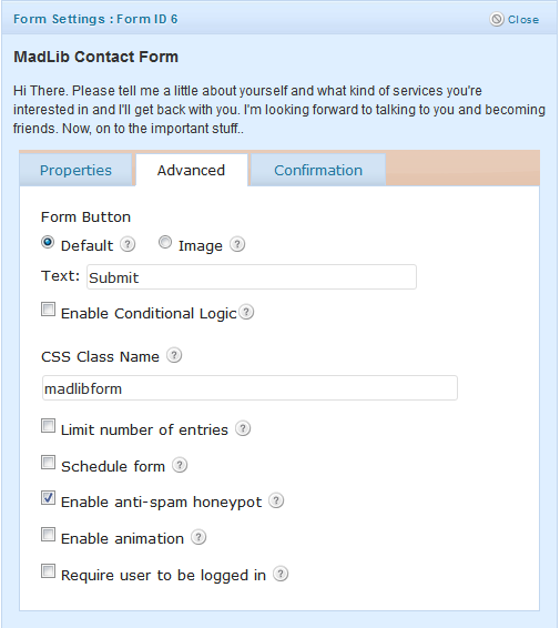
Once you have Gravity Forms installed you will need to make the form. The name isn’t all that important since it won’t be shown using my modifications. Click to edit the form settings and fill in your description. Then click the “advanced” tab and add the class “madlibform.”

You can also setup the confirmation settings while you are there. Now add some standard fields. This form uses single line text fields, drop down fields, and HTML fields.
HTML Fields
The HTML fields are where you type the text you wish to display. Make sure you click “disable default margins” so the fields don’t get any added margin values that will throw the text off. If you want to force the text to a new line you can give it the class “break” by clicking the advanced tab and typing break into the CSS Class Name field. This is a difference in the code I’m using and the code in the Gravity Forms tutorial. I found that sometimes lines didn’t layout exactly the way I wanted so I needed a way to force a new line. The Gravity Forms tutorial used display: inline-block to get the elements to line up then tried to fix this for other browsers that don’t support the inline-block display value. This makes forcing a new line very difficult, so I switched to old school CSS using float: left and margin fixes. Then I just needed to have a clear both for new lines and presto, new line. Much easier and it works better on older browsers.
Single Line Text Fields
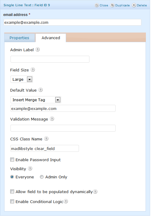
Single line text fields are super easy to set up. Make sure you fill in the field label. This will make your form readable/useable for anyone using a page reader. You could setup an input mask, but I skipped that for the default value that shows what I expect to be in the field so click on the advanced tab after filling in your label. First, make sure you select a large field size, then put your demo text into the default value field. Now make sure you put “madlibstyle clear_field” into the CSS Class Name field. More on the clear_field value in a bit.

Drop Down Fields
The Drop Down field is setup just like the Single Line Text field except you specify the options for your drop down selector then click the advanced tab select the large field size and put “madlibstyle” in the CSS Class Name field. You don’t need “clear_field” here.
Once you get your form built you will see it doesn’t look right. Everything lays out like a normal form. Let’s fix that.
Style Your Form
The CSS from Gravity Forms is a really good start but I needed some better code. Using IDs really limits you, so those had to go. Also, I needed to style my page title and wanted to drop the background for my content area then fix the box shadow and some other things. This is really easy if you are using Genesis. You can add a custom body class in the Custom Body Class field of the page you will be inserting the form into. I used “madlibcontact.” This let’s me style any part of the page that is using this value, not just the form I setup. This means my page title can be formatted and all the other elements I needed to change. Most of this is straight from the Gravity Forms example.
/* MadLib Form
------------------------------------------------------------ */

/*The following is specific to Streamline 2.0*/
.madlibcontact.full-width-content #inner .wrap {
	background: none repeat scroll 0 0 transparent;
	box-shadow: none;
}

.madlibcontact #inner #subnav .wrap {
	box-shadow: 0 0 10px #111111;
}

.madlibcontact #content-sidebar-wrap {
	border-top: none;
}
/*End streamline 2.0 CSS */

.madlibcontact .hentry {
	position: relative;
}

.madlibcontact h1 {
	background: url("images/blue/button.png") repeat-x scroll 0 0 transparent;
	border-radius: 10px 10px 10px 10px;
	color: #FAFAFA;
	left: 55px;
	padding: 10px;
	position: absolute;
	text-shadow: 1px 1px #2C546B;
	top: 55px;
	z-index: 99;
}

/* make all the list items display inline */
body .gform_wrapper form.madlibform .gfield.gfield_html,
body .gform_wrapper form.madlibform .gfield.madlibstyle {
	clear: none;
	display: block;
	float: left;
	height: 40px;
	line-height: 40px;
	margin: 0 5px 0 0;
	padding: 0;
	vertical-align: bottom;
	width: auto !important;
}

body .gform_wrapper form.madlibform .gfield.break {
	clear: both;
}

/* hide the labels, descriptions & validation messages */
body .gform_wrapper form.madlibform .gfield.madlibstyle label,
body .gform_wrapper form.madlibform div.gfield_description,
body .gform_wrapper form.madlibform div.validation_message {
	display:none;
}

/* redefine the form wrapper - just for nicer styling - note: for your form, change gform_wrapper_6 to your actual form wrapper ID */
body .gform_wrapper  {
	margin:50px auto;
	border:1px solid #fff;
	background-color:#fff;
	padding:30px;
	-moz-border-radius: 8px;
	-webkit-border-radius: 8px;
	border-radius: 8px;
	-khtml-border-radius: 8px;
	box-shadow:0px 0px 5px rgba(0,0,0,0.5);
	-moz-box-shadow:0px 0px 5px rgba(0,0,0,0.5);
	-webkit-box-shadow:0px 0px 5px rgba(0,0,0,0.5);
	position: relative;
	overflow: visible!important;
	background-image:url(https://dl.dropbox.com/u/688846/gravityhelp/sampleimages/topgradient.png);
	background-repeat:repeat-x;
	background-position: 0 0;
}

/* style the form heading */
body .gform_wrapper form.madlibform .gform_heading {
	background-image:url(https://dl.dropbox.com/u/688846/gravityhelp/sampleimages/divider.png);
	background-repeat:repeat-x;
	background-position: 50% 100%;
	padding-bottom:60px;
	margin:35px 0 10px 0;
}

body .gform_wrapper form.madlibform .gform_heading span.gform_description {
	line-height:1.5;
	font-size:110%;
	color:#21759B
}


/* change the input styles for these fields */
body .gform_wrapper form.madlibform .gfield.madlibstyle input[type=text],
body .gform_wrapper form.madlibform .gfield.madlibstyle input[type=email],
body .gform_wrapper form.madlibform .gfield.madlibstyle input[type=password],
body .gform_wrapper form.madlibform .gfield.madlibstyle input[type=url],
body .gform_wrapper form.madlibform .gfield.madlibstyle input[type=tel] {
	margin-top:4px;
	border-top:none;
	border-right:none;
	border-bottom:1px dashed #c2c2c2;
	border-left:none;
	background-color:#fff;
	width:100%;
	font-size:18px;
	color:#21759B
}

body .gform_wrapper form.madlibform .gfield.madlibstyle select {
	width:98%;
	font-size:15px;
	padding-right:5px;
}

/* tweak the time fields for our purposes */
body .gform_wrapper form.madlibform #field_2_16.gfield.madlibstyle {
	width:100px!important
}

/* a few new rules for the inputs if it's an error */
body .gform_wrapper form.madlibform .gfield.gfield_error.madlibstyle input[type=text],
body .gform_wrapper form.madlibform .gfield.gfield_error.madlibstyle input[type=email],
body .gform_wrapper form.madlibform .gfield.gfield_error.madlibstyle input[type=password],
body .gform_wrapper form.madlibform .gfield.gfield_error.madlibstyle input[type=url],
body .gform_wrapper form.madlibform .gfield.gfield_error.madlibstyle input[type=tel] {
	padding:0!important;
	margin-top:7px;
	width:96%;
}

/* revised error styles */
body .gform_wrapper form.madlibform .gform_body .gform_fields .gfield.gfield_error.madlibstyle {border:none; padding:0 0 0 0!important; background-color:transparent!important; margin-top:0!important; margin-bottom:0!important;}
body .gform_wrapper form.madlibform .gform_body .gform_fields .gfield.gfield_error.madlibstyle input { border-top:none; border-right:none; border-bottom:1px dashed #DA5712; border-left:none; background-image:url(https://dl.dropbox.com/u/688846/gravityhelp/sampleimages/bang.png); background-repeat:no-repeat; background-position: 98% 50%;}
body .gform_wrapper form.madlibform .gform_body .gform_fields .gfield.gfield_error.madlibstyle input:focus {border-bottom:1px dashed #c2c2c2}
body .gform_wrapper form.madlibform div.validation_error {
	font-size:24px;
	text-shadow:1px 1px 1px #fff;
	color:#DA5712!important
}

/* now make the confirmation message a little spiffier */
div#gforms_confirmation_message {
	width:900px;
	margin:40px auto;
	font-size:24px;
	text-shadow:1px 1px 1px #fff;
	color:#21759B!important;
	background-color:#fff!important;
	border:1px solid #fff!important;
	letter-spacing:-0.4pt;
	line-height:1.8;
	padding:40px 30px;
	-moz-border-radius: 8px;
	-webkit-border-radius: 8px;
	border-radius: 8px;
	-khtml-border-radius: 8px;
	box-shadow:0px 0px 5px rgba(0,0,0,0.5);
	-moz-box-shadow:0px 0px 5px rgba(0,0,0,0.5);
	-webkit-box-shadow:0px 0px 5px rgba(0,0,0,0.5);
	background-image:url(https://dl.dropbox.com/u/688846/gravityhelp/sampleimages/topgradient.png);
	background-repeat:repeat-x;
	background-position: 0 0;
}

div#gforms_confirmation_message span.highlight {
	color:#DA5712
}

div#gforms_confirmation_message div.with_emphasis {
	font-size:36px;
	margin:20px 0 0 0;
	font-family: Georgia, serif;
}

/* super duper extra fabulous form button and title styles */
.gform_wrapper form.madlibform .gform_footer input.button,
.gform_wrapper form.madlibform .gform_heading h3.gform_title {
	background: url("images/blue/button.png") repeat-x scroll 0 0 transparent;
	border: medium none;
	color: #FFF3D8;
	display: block;
	height: 37px;
	text-align: center;
	width: 246px;
}

/* position the button */
.gform_wrapper form.madlibform .gform_footer input.button {
	position: absolute;
	bottom:-30px;
	right:28px;
	cursor:pointer;
}


/* other title styles */
.gform_wrapper form.madlibform .gform_heading h3.gform_title {
	position: absolute;
	top:-40px;
	left:28px;
	width:auto!important;
}

/* browser specific styles based on body class - don't use it? You should.. http://www.wprecipes.com/how-to-detect-the-visitor-browser-within-wordpress */
body.safari .gform_wrapper form.madlibform .gfield.madlibstyle select,
body.chrome .gform_wrapper form.madlibform .gfield.madlibstyle select {color:#424242; font-size:18px; font-family:Helvetica,arial,sans-serif;}
body.safari .gform_wrapper form.madlibform .gfield.madlibstyle select#input_2_4,
body.chrome .gform_wrapper form.madlibform .gfield.madlibstyle select#input_2_4 {width:135px;}
body.safari .gform_wrapper form.madlibform .gfield.madlibstyle select#input_2_17,
body.chrome .gform_wrapper form.madlibform .gfield.madlibstyle select#input_2_17 {width:55px;}
body.gecko .gform_wrapper form.madlibform .gfield.madlibstyle select {margin:4px 0 0 0!important;}
body.gecko .gform_wrapper form.madlibform .gform_footer input.button {padding:8px 18px;}
body.safari .gform_wrapper form.madlibform div.validation_message,
body.ie .gform_wrapper form.madlibform .gfield.madlibstyle select {padding:0!important; margin:7px 0 0 0!important;}
There are a couple of images being used, you can grab them off my site if you like or adapt the backgrounds to suit your own needs.
Add Javascript to blue/focus your form fields
Remember that “clear_field” class? That is what does the magic for getting the default values to disappear when you click/tab to the field. Otherwise your users will have to delete that value and you don’t want people to have to work any harder than necessary.
First, make a new file in your child theme. I recommend putting it in a /js/ director. It should be named form.focus.js. Now put this in the file.
// CLEAR FORM FIELDS OF LABEL ON FOCUS THEN ADD BACK ON BLUR IF EMPTY (class of 'clear_field' must be added to form field) //

jQuery(document).ready(function($){
	$(".clear_field input").focus(function () {
		var origval = $(this).val();
		$(this).val("");
		//console.log(origval);
		$(".clear_field input").blur(function () {
			if($(this).val().length === 0 ) {
				$(this).val(origval);
				origval = null;
			}else{
				origval = null;
			};
		});
	});
});
Now add this to your functions.php file
add_action( 'wp_print_scripts', 'ntg_theme_scripts' );

function ntg_theme_scripts() {

   wp_enqueue_script( 'ntg-form-focus', get_bloginfo( 'stylesheet_directory' ) . '/js/form.focus.js', array( 'jquery' ), '1.0', true );

}
Once everything is updated it should clear your fields. FYI, I found this code and only had to make a few minor changes to make it work correctly. I was going to link to the code but their site is down right now and that is just plain annoying. So if someone see this and says “hey that’s my code!” Sorry dude, leave a comment or contact me when your site is finished being redesigned and I’ll include the attribution.
I think that just about gets it. You can see the form live on my contact page. Have anything you would do differently or any examples of other cool contact forms?
 WordPress 3.4 and Genesis
 Must Have Plugins are a Myth
 Site Recovery Tips and Tricks
 Theme Customization Basic Skills
 Custom Post Types Made Easy
wow! this is awesome man! will surely give it a try.
Very nice Nick!
I never thought of this concept.
Great job and very useful.
I love the form Nick and I appreciate the time you spent on it. I’m going to be tracking the madlib form from a conversion standpoint. I’ll let you know how it works from a marketing angle after we launch the site. I”m gathering statistics now on their old contact page. Should be fun!
Nick just wanted to say thanks for the tutorial. I’ve wanted to customize my contact page to look like this for a while but never could figure it out lol.