Live Demo [download id=”1″ format=”1″]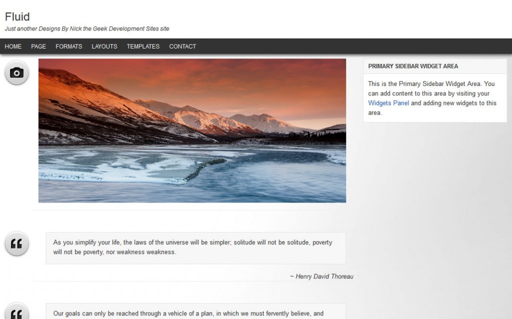
I’ve fielded several questions about a “fluid width” theme since I’ve started helping at StudioPress. A while back I started an experiment to see how I might make that happen with the various layouts available in Genesis. The process is actually not super complex. There is no need for any PHP changes, but it does require somewhat advanced CSS techniques including positioning, variable margins, and min/max-widths.
I had thought about writing a tutorial on this, but quite frankly, I did this so long ago that I’m not sure exactly how to document the process.
Instead I’ve decided to release the theme I did as a “free” theme. I’ve put free in quotes because it is free right now, but in a few weeks I’m going to switch it over to a paid theme. So if you want it for free, get it now.
The theme itself is a mostly stock theme with some very important key features.
Fluid Width
The content will automatically adapt to the browser size, up to 1400px wide. There are 4 values to change in the style sheet if you want wider, the max-width: 1400px on the #header .wrap, #nav .wrap, #subnav .wrap, and #inner selectors. I had initially tested with much wider, and this created very long text strings that are quite frankly hard to read. At 1400px the theme will adjust to fit most screen resolutions currently viewing sites but still have nice text blocking for long text strings
If you wish to change the max-width to a truly full width theme for widescreens, remove or change the max-width in the style sheet for these values
#header .wrap {
    min-width: 840px;
    max-width: 1385px;
}

#nav .wrap {
    min-width: 850px;
    max-width: 1400px;
}

#subnav .wrap {
    min-width: 850px;
    max-width: 1400px;
}

#inner {
    margin: 0 0 20px;
    padding: 10px 0 0;
    max-width: 1400px;
    min-width: 850px;
    overflow: hidden;
    position: relative;
}
Fixed Header and Navigation
The Header and Primary Navigation are “fixed” at the top of the page, so it stays in place while the site scrolls underneath. This is another feature I’ve seen requested time and time again in the StudioPress Forums.
Full Post Format Support
Most of the StudioPress themes with Post Format support only offer minimal content adjustment for additional post formats. This theme uses the same functionality I built into my personal blog, creating unique layouts.
- Status updates: inserts the avatar like a twitter update. Also, provides custom field and formatting for “mood.”
- Galleries: inserts featured image as well as some auto-formatted text to indicate how many images are in the gallery.
- Video: removes title but shows full content, when media embeds you can just put in the URL for a video and it will work perfectly
- Aside: strips all additional formating for simple “aside” style updates.
- Quote: Custom field provided which will enable the quote to be put in
<blockquote>tags and also provides a Custom Author and source output - Link: Custom field provided which creates link title and url output to build a link that goes to provided URL and also redirects the post link to the provided URL.
- Audio: Custom field provided which creates the correct short code for working with the Audio Player plugin.
This theme also supports the Chat format, but defaults to the standard formatting used for Asides.
Custom Post Meta Boxes
As noted above, this theme provides several custom fields. These are “hidden” fields and are handled via a very simple custom meta box. Everything is structured and easy to use. This is built on the Custom Meta Box class from Bill Ericson, and allows the theme to be very easily extended for use with several other custom fields using the provided example code to build your own meta boxes or extend the themes built in meta boxes.
Header Menu Icons
This theme includes 40 built in icons for the header right. It is very easy to use too. Just add “social icon-name” to the menu item when setting up your custom menu. The advanced CSS is also super simple. The “social” class sets the background image and size for the menu link, and the “icon-name” set what part of the image shows. This is much more efficient than loading 40 images, and keeps the CSS nice and clean too.
Separate Admin and Front End Functions
One of the keys to this theme is the ability to see how I code a theme for maximum efficiency. Using code like the Custom Meta Box class is one step to making more efficient code. Another trick I use is to create files that load the functions needed in the admin system and load them separately from the code used on the front end of the site. By doing this I can reduce the amount of unused code loaded at any given time and speed things up.
Download and Preview
Like I said, I’m making this theme free for a limited time. I want to get the word out and also help others to build their own fluid width theme using my techniques. One important note, you need the Genesis Theme Framework from StudioPress to use this theme. Get it now. So, check it out then download it.
Live Demo [download id=”1″ format=”1″]

 Genesis Responsive Header Updated
 Genesis Responsive Header
 How I Make Custom Fields Easier in Genesis
 How I Added Custom Fields to the Genesis Responsive Slider
 A Better Home Page
Perfect! Exactly what I needed to commit to Genesis. Looks like I had extremely good timing regarding this problem. Thanks for all your help!
Thanks, Nick, for continuing to generously share with the rest of us!
Nick – Stacked widgets only showing first position in both the Primary and Secondary Sidebars.
Could you please elaborate? I’m not sure I follow.
Only first widget appearing in sidebars (on my browser at least). To verify, I added the Calendar, Text and Image widgets to both sidebars in that order but only the Calendar widget was visible.
on the demo or on your site? What browser?
Nick – see below
see comments on landing page of this test site
http://www.aircraftmedia.com
ok, I see the problem, it isn’t the plugin it is the page content. Because of the way the positioning is handled there will need to be a min-height added for situations where sidebars are longer than the content. This will be site specific, so you will need to set it like this for the site you linked to
#content { min-height: 910px; min-width: 370px; padding-left: 10px; padding-right: 320px; }Good to know. A very useful theme to have in the arsenal.
Your work is always top-class and Brian Gardner would do well to set your standards as the benchmark for support staff at Studiopress.
FYI, I edited the theme and released an update that fixes this with a small javascript.
Nick,
Just wanted to add a thank you for the release of this theme. It’ll certainly prove a useful model when attempting to either design to a fluid screen width, or to use the post format images and features that you use so well.
Thanks again!
Awesome theme just downloaded it now, will play with it soon 😀 thanks a lot for your awesome design and work 🙂 and i have sent a friend request to you on facebook 🙂
Are you still working on the productions theme project?
Production is not available via StudioPress any more since I am not a copyblogger employee
With fixed navigation, a scrollable navigation also shows up.. any solution? 🙂
I’m not entirely sure what you mean, could you provide some more detail?
How can i remove the post info?
As i’ve tried to put this code to function.php
/** Remove the post info function */
remove_action( ‘genesis_before_post_content’, ‘genesis_post_info’ );
But it doesn’t work. Can you please help?
Nice theme… just installed for http://infobee.in .. From were i get directions to make some navigational changes while using this theme.Thanks in Advance
I’m fine with this theme and I’dd use it for long. The problem is that post formats will be killed in 3.6. Will fluid need reworking?
My understanding is they pulled everything they did with post formats, so it is back to the same post formats that have been there.
Nice theme, but it will be great if you provide a responsive version of this theme.
Thanks, I am working on an HTML5/Responsive version. It is a labor of love so I get to it when I have the time but working 12-16 hour days means I don’t have a lot of time.